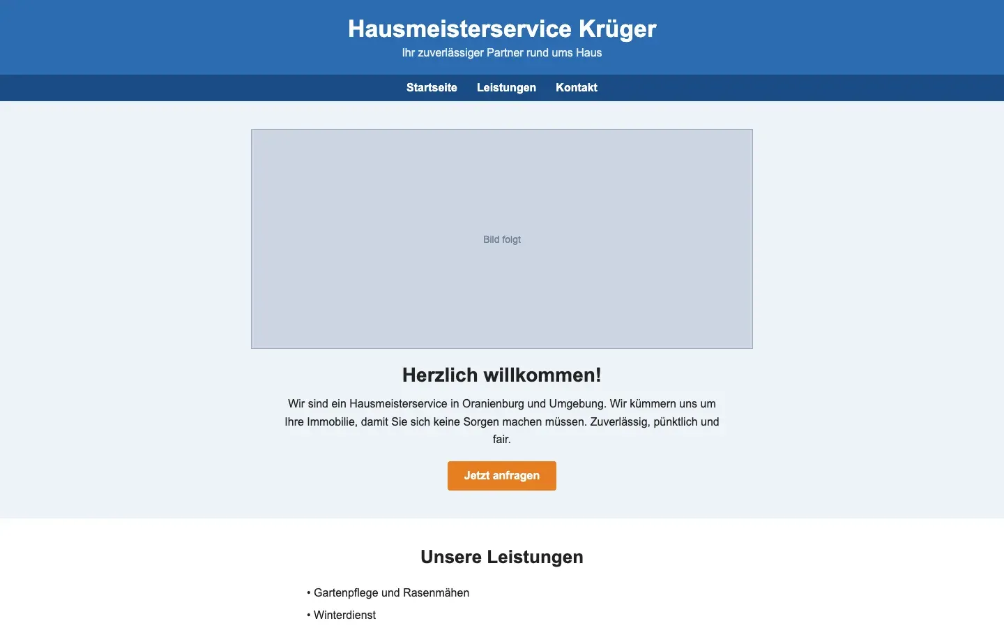
What slop looks like in local services and trades
A stock handyman with a tool belt, "Your reliable partner for all your needs", a services grid of twelve things nobody does all of, a map of the wrong town, and a phone number in the footer only. Often the business is real and good; the page is a template nobody filled in.
What a designer would have done
The phone number and the area served on the first screen, a photo of the actual van or the actual person, the three services they really do, a price indication, and two sentences in their own words. Honest and plain is not slop, which is why these sites often end at "Lazy, but human".
Tells to check first
- A template nobody customised: The demo template's structure, section order, placeholder image ratios and sample headings are all still there, with only the words changed.
- Not one real photograph: Nothing on the site shows this business's actual place, people, product or work.
- The swap-test headline: A headline of the form "Innovative solutions for your business" or "Your reliable partner for X": swap in a competitor's name and nothing changes.
- No address, no phone, no name: No physical address, no phone number, no named person anywhere, only a form that may or may not work.
- Social links to the platform home page: Footer icons for X, LinkedIn, Instagram and Facebook that link to x.com, linkedin.com and instagram.com, not to any account.