What it looks like
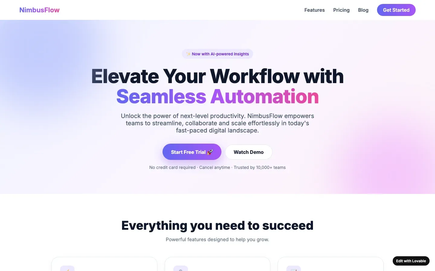
The whole page set in Inter, Poppins or the framework’s default stack at the framework’s default sizes: 16px body, a 48px heading, weight 600 on everything that wants attention, the default line height, the default letter spacing. Nothing about the type says what kind of business this is.
Why it gives a page away
A font is not a crime; Inter is a good typeface and so is Geist. The tell is that the whole type scale is the framework’s. Type is the first thing a designer touches, because it is the cheapest way to make a page belong to someone, and an untouched scale means nobody touched it. Weak on its own: plenty of honest sites use the defaults well.
How to check your own site
Open the developer tools and look at the body font and the h1 size. If both are the framework’s defaults, and so are the weights, nobody has made a type decision yet. Then look at the logo: if its letters have nothing in common with the page, the page did not look at the logo.
What a designer would do instead
Choose one typeface for headings that fits the business, keep a plain one for the body, and set three sizes on purpose: a headline large enough to be the headline, body text at a width that is comfortable to read, and one small size for labels. One size change shows a person was there.
When it is not a tell
A deliberately plain site that uses the system font as a decision and looks consistent. Restraint that is consistent is a style; restraint that is leftover is a default.
Builders whose defaults include this one
An entry names a builder only when its fingerprints are visible; this tell is one of them for v0 by Vercel.
Other tells in visual style
- Glass panels: Semi-transparent panels with a backdrop blur and a thin light border, stacked over a gradient so there is something to blur.
- Glowing blobs and orbs: Blurred circles of colour floating behind the content, or a glowing orb as the hero image of a product that has no shape.
- Gradient text: A headline, or one word in it, filled with a colour gradient and clipped to the letters.
- Permanent dark mode: A near-black page for a business that has no reason to be in the dark: a bakery, a physiotherapist, a tax advisor.
- Rounded corners on everything: Cards, buttons, images, inputs and badges all share one large corner radius, usually the framework's largest preset.
- Second-generation tasteful defaults: Cream with terracotta, or near-black with acid green, applied as the automatic answer to "don't make it look like AI".
- The italic serif accent word: One word of the headline set in an italic serif, the rest in a sans, as the single "designed" touch on the page.
- The purple gradient: A hero background or button that fades from indigo to violet to pink, the house colour of the 2024 to 2026 AI builder generation.