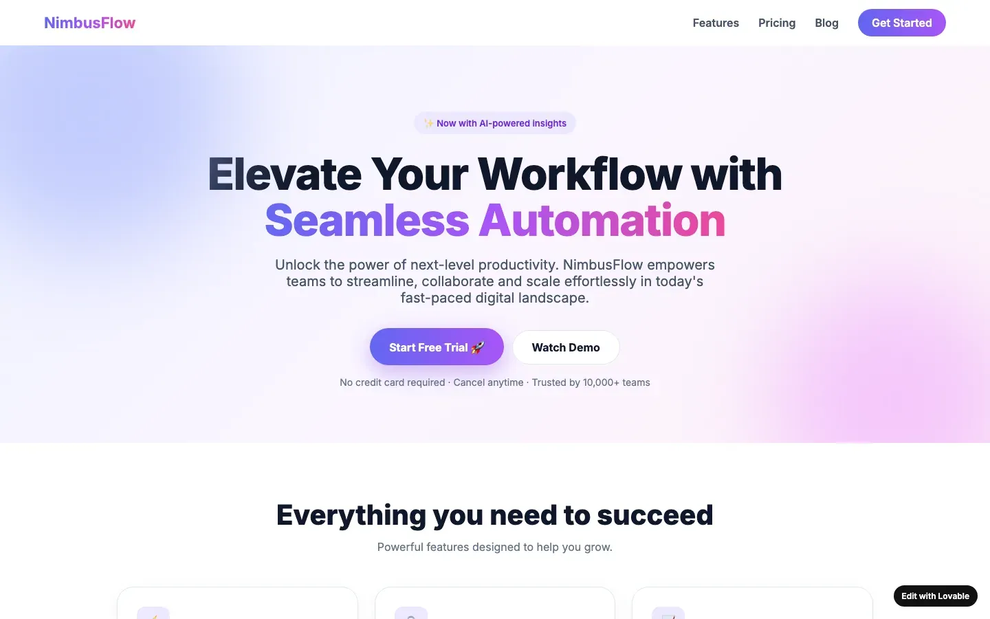
What slop looks like in saas
A purple-to-indigo gradient hero, a headline of the form "Supercharge your workflow", two pill buttons, a logo wall of companies that have never heard of the product, three feature cards with icons in tinted squares, and a pricing table whose middle plan is "Most popular". The dashboard screenshot is a render with grey bars where the data would be.
What a designer would have done
Show the real product doing one real thing: a screenshot with real data, a sentence that says what the software does and for whom, a price that is a number. Customer logos only when they are customers. One accent colour that was chosen, not inherited from the framework.
Tells to check first
- The purple gradient: A hero background or button that fades from indigo to violet to pink, the house colour of the 2024 to 2026 AI builder generation.
- Three icon cards: A row of three identical cards, each with an icon in a tinted rounded square, a four-word heading and two lines of text that say the same thing three ways.
- Logos of companies that never heard of them: A "Trusted by" row of Google, Microsoft, Amazon and Netflix logos on a six-week-old company with no case study.
- Suspiciously round numbers: "10,000+ happy customers", "99.9% satisfaction", "500+ projects delivered", on a company that registered its domain this spring.
- Elevate, unlock, seamless, empower: Headlines and subheads built from the model's favourite verbs: elevate, unlock, empower, streamline, seamless, effortless, next-level, game-changing.
- Pill badge above the headline: A small rounded pill with a sparkle and "New" or "Now with AI" sitting above the H1, followed by a filled button and a ghost button, on a page that is announcing nothing.