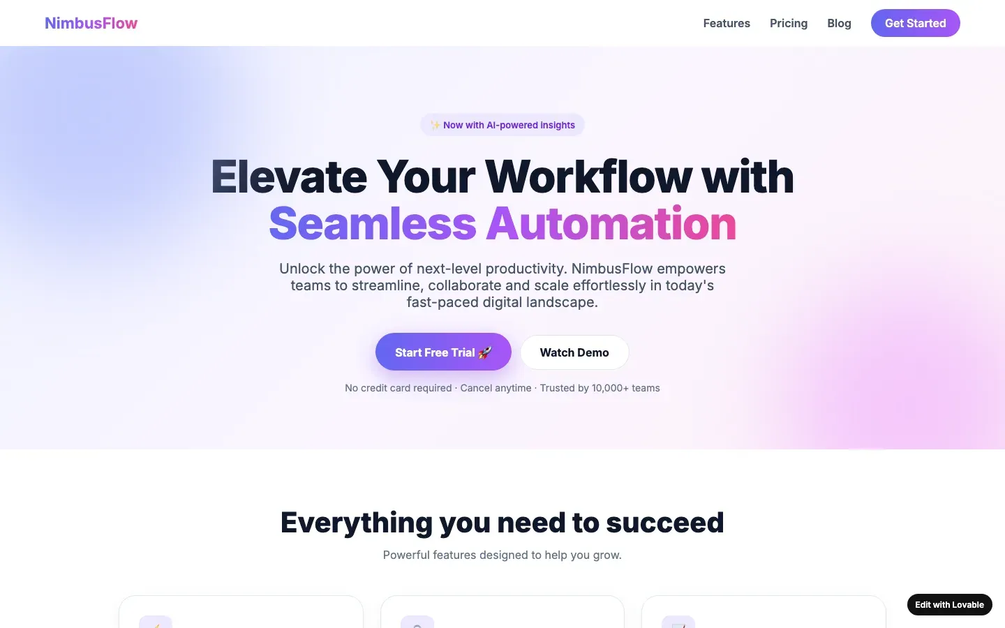
A CSS trick that reads as “we know CSS”. It breaks on selection, prints as a grey smear, and the fashion lasted one year. On a generated page it almost always sits over a purple gradient hero.
Builders whose defaults include this one
An entry names a builder only when its fingerprints are visible; this tell is one of them for Bolt and Lovable.
Other tells in visual style
- Glass panels: Semi-transparent panels with a backdrop blur and a thin light border, stacked over a gradient so there is something to blur.
- Glowing blobs and orbs: Blurred circles of colour floating behind the content, or a glowing orb as the hero image of a product that has no shape.
- Inter or Poppins, untouched: The page is set in Inter, Poppins or the framework default at the default sizes, with no type decision visible anywhere.
- Permanent dark mode: A near-black page for a business that has no reason to be in the dark: a bakery, a physiotherapist, a tax advisor.
- Rounded corners on everything: Cards, buttons, images, inputs and badges all share one large corner radius, usually the framework's largest preset.
- Second-generation tasteful defaults: Cream with terracotta, or near-black with acid green, applied as the automatic answer to "don't make it look like AI".
- The italic serif accent word: One word of the headline set in an italic serif, the rest in a sans, as the single "designed" touch on the page.
- The purple gradient: A hero background or button that fades from indigo to violet to pink, the house colour of the 2024 to 2026 AI builder generation.