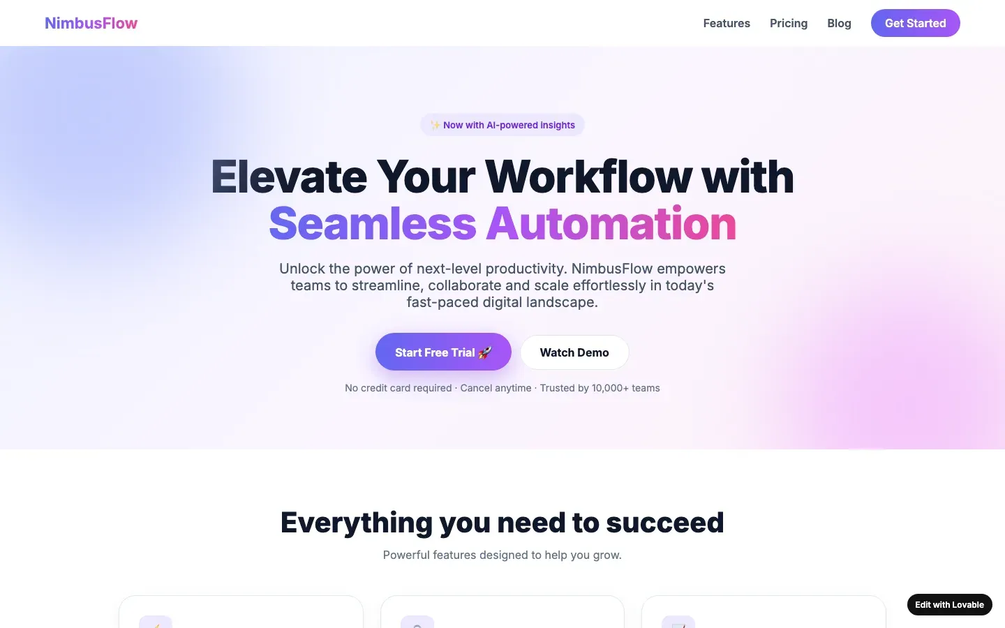
What it looks like
A row of three identical cards under the hero: an icon in a tinted rounded square, a four-word heading, two lines of text that say the same thing three ways. “Fast. Secure. Scalable.” “Plan. Build. Grow.” On a phone the three stack into one long column of the same card.
Why it gives a page away
One of the most common shapes on unedited pages. People who design feature sections vary them: one wide, two narrow, a picture here, a number there, because real features are not the same size. Generators produce three equal cards because the training data is full of them and because three fits the grid. The icons are the giveaway within the giveaway: a shield, a bolt and a chart, from one icon set, that would illustrate any three features in the world.
How to check your own site
Cover the icons with your hand and read the three headings. If you could swap them without changing the page, they are decoration. Then ask what the three things actually are; usually one of them is the product and the other two are padding.
What a designer would do instead
Show the one feature that matters, large, with a real screenshot or photo and a sentence that names a number. If there are genuinely three things, give each the space it needs, which is never the same space.
When it is not a tell
Three real, parallel things that belong in a row: three price tiers, three locations, three steps that are really three steps. The tell is sameness without a reason.
Sources
Builders whose defaults include this one
An entry names a builder only when its fingerprints are visible; this tell is one of them for 10Web, Lovable, v0 by Vercel, Webflow AI and Relume and Wix AI site builder.
Other tells in layout and structure
- Bento grid for no reason: A grid of unequal rounded tiles with a sentence in each, used for content that has no reason to be tiled.
- Everything centred: Every heading, paragraph and button centred, with no left edge anywhere on the page.
- Pill badge above the headline: A small rounded pill with a sparkle and "New" or "Now with AI" sitting above the H1, followed by a filled button and a ghost button, on a page that is announcing nothing.
- The conveyor belt: Hero, three features, a testimonial row, a pricing table and a final call to action, in that order, with nothing specific to this business anywhere in the sequence.